
Design note · Nila Original
Menopause isn't pink
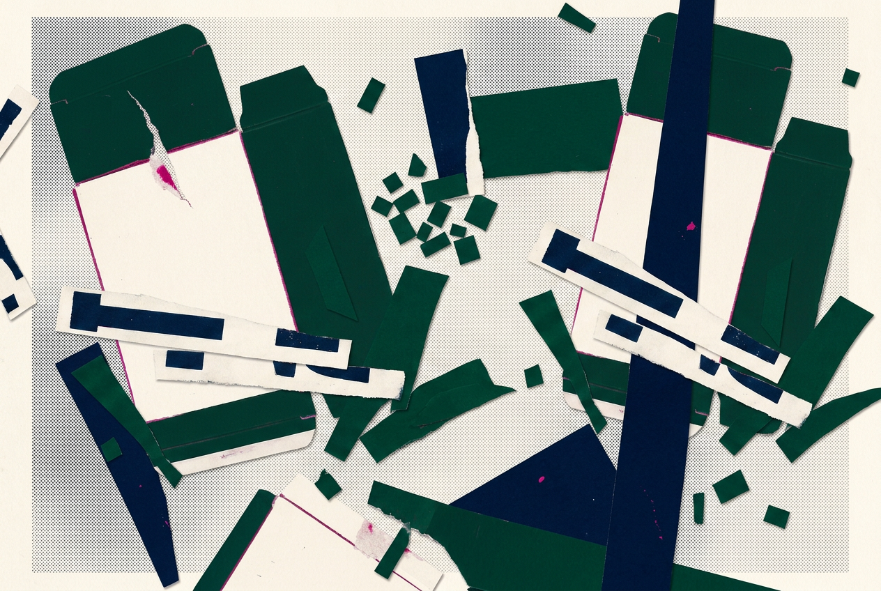
The pink box in the pharmacy aisle never had much to say to me. A design note on the doorways, language and colours that make Nila a wider place to land.
The pharmacy aisle told me who menopause was for before any doctor did. Pink boxes. Soft flowers. A woman laughing alone with salad, which has never been anyone's actual response to a hot flash.
The woman on the box is 51, cisgender, her timing textbook. She's real, and she deserves good care. She's also a fraction of who actually goes through this.
I wasn't her. I went into surgical menopause overnight, after hormone-positive breast cancer took my ovaries off the table along with everything else. There was no perimenopause to ease in with. One day I had hormones, the next day I didn't, and the box in the pharmacy aisle had nothing to say to me.
That was the first design decision, though I didn't know it yet. If I was going to build anything, it couldn't be pink-box shaped.
The doorways
Most menopause products start with one door: a woman, around 51, noticing changes. Everyone else climbs in through a window.
I built eleven doors instead. Six up front, five more for the people the industry keeps forgetting: no periods to go by because of an IUD, an ablation, or a hysterectomy. Under 40. Trans or non-binary. Here for someone else. Not sure yet.
Each one is a person I kept meeting. The 34-year-old in early menopause who needed more than one appointment to understand what was happening. The trans man who kept his ovaries and then watched them start their own ending, with nowhere to take his questions. The woman after cancer for whom systemic hormone therapy isn't an option, reading advice written for people choosing between options she doesn't have. The ADHDer whose medication stopped working the way it used to and who needed room to explore more than stress alone.
"Every body" is easy to print on a box. It's harder as a practice. It means every guide gets checked for who it assumes. It means never writing "as women age" when you mean "as estrogen drops," because those aren't the same sentence and they don't describe the same people.
The language
I use anatomy-first language, which sounds technical and is actually just precise. I say "women" when I mean women. When I mean people with ovaries, I say that. When I mean people taking testosterone, I say that.
Precision matters here. A trans person reading a guide that keeps calling them "she" doesn't feel included, they feel misread, and a misread person stops trusting the next sentence. Trust is the whole product. I can't afford to spend it on pink.
Pronouns get the same treatment. They/them in a symptom guide keeps the door open without guessing the reader's gender. Getting it wrong costs exactly as much trust as getting the anatomy wrong.
When I wrote about hormones and mental health, I wrote it for everyone whose hormones are changing, whatever their gender, and I stayed exact about who each study actually included. The studies I discussed didn't include everyone. Saying so matters to the writing.
The palette
Then there was the colour. Menopause branding has two settings: clinical beige, which says "this is a medical problem," and Pepto pink, which says "this is a girls' club." I didn't want either.
The palette I locked is navy for the structure, deep green for the evidence, and the punk magenta kept on a short leash: primary actions and selected states only. No majority-pink screens. No pink as a personality.
Colour is a promise about who belongs. Pink promises the 51-year-old on the box. Navy doesn't promise anyone in particular, which means it doesn't un-promise anyone either. That's the whole idea. A menopause app shouldn't look like it was decorated for someone else's party.
What it costs
Here's the part nobody puts in the brand deck. Inclusion needs maintenance long after launch. Every new guide has to be checked. Every doorway has to stay honest as the product grows. The day I stop checking is the day it quietly becomes another pink box with better intentions.
I wrote separately about how most health data is built around that same 51-year-old woman, and what it means to be invisible to the system keeping your records. This is the other half of that piece. Invisible in the research, invisible in the product. You can't fix the second one without deciding the first one matters.
The aisle is still pink. I'm just building the other shelf, one precise sentence at a time.
Piece 2 of 6 · Built for every body that arrives. · Framework: Human-centred evidence
Companion pieces: The patient at the centre of the record doesn't exist · Your ring doesn't know how last night felt · When hormones shift, mental health shifts with them
Hello Nila's library holds 91 free symptom guides, browsable by body system, with evidence graded A–D and every source named. hellonila.com